Hey there, web wanderer! If you’re reading this, it means you’re either a web design enthusiast or you’ve accidentally clicked on the wrong link while trying to order pizza online. Either way, you’re in for a treat! In this whimsical journey through the world of web design, we’ll explore the latest techniques that can make your website shine like a supernova on the digital runway.
The Canvas of Creativity:
Imagine your website as a blank canvas, waiting for your creative brush strokes. Web design is no longer about just slapping some text and images onto a page. It’s an art form, and we’re about to unveil the Mona Lisa of web design techniques!
1. Responsive Design: The Yoga Guru of Web Design
Is your website flexible, like a yoga guru stretching to accommodate all screen sizes? If not, you’re in for a world of hurt! Responsive design is all the rage, ensuring your site looks jaw-dropping on smartphones, tablets, and gigantic desktop screens alike. Google loves it, and so do users. So, go ahead, give your website a good stretch!
2. Minimalism: Less is More, Baby!
Remember the good old days when websites resembled a teenager’s bedroom – cluttered and chaotic? Well, times have changed! Minimalism is in, and it’s all about simplicity. Clean lines, lots of white space, and a minimalist color palette – it’s like the Marie Kondo of web design. If it doesn’t spark joy, it’s gotta go!
3. Animation Magic: The Show Must Go On!
Boredom is the mortal enemy of websites. Keep your audience engaged with subtle animations. Hover effects, parallax scrolling, and micro-interactions can make your website feel like a fun carnival ride. Just don’t overdo it; you don’t want your website to look like a disco ball!
4. Typography: Fonts That Speak Volumes
Fonts are like accents in a movie – they set the tone. Forget about Times New Roman; we’re talking about elegant serif fonts, playful sans-serifs, and quirky display fonts. Choose wisely, and your website will speak volumes without saying a word.
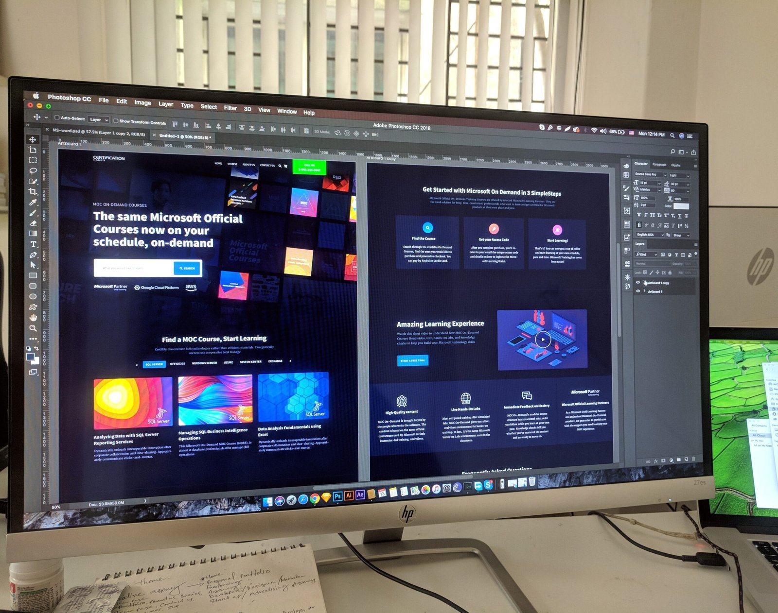
5. Dark Mode: Embrace the Dark Side
Dark mode isn’t just for vampires and Sith Lords anymore. It’s a trendy web design choice that’s easier on the eyes, conserves battery life, and looks downright cool. Give your users the power to switch between light and dark modes, and they’ll love you for it.
6. User Experience: The Red Carpet Treatment
Imagine your website as a fancy hotel – you want your visitors to feel like VIPs. Optimize user experience with smooth navigation, fast loading times, and intuitive layouts. If your website is a maze, your visitors will feel like they’re in a cornfield at night.
7. Video Backgrounds: Lights, Camera, Action!
Static images are so last season. Spice up your website with video backgrounds that tell a story or set the mood. Just make sure it doesn’t turn into a full-blown Hollywood blockbuster and slow down your load times.
8. Voice User Interface (VUI): Talk to Me, Baby!
With the rise of voice-activated assistants like Siri and Alexa, VUI is gaining momentum. Integrating voice commands into your website can make user interactions as smooth as butter. Imagine your website responding to voice commands like a loyal butler – now that’s classy!
In conclusion, web design is a delightful blend of art and science. Embrace these latest techniques, and your website will be the belle of the digital ball. Remember, in the ever-evolving world of web design, staying on-trend is the key to success. So, go forth, dear web designer, and create a website that dazzles, engages, and leaves a lasting impression. Happy designing!


